Graphs and Data Visualization
Last updated: September 16, 2026
Alpaca gives you two places to view a client's data: the Chart tab inside a single program, and the Data Visualization tab, which compares several programs at once. This guide covers the chart types, program averages, graph settings, phase change and event lines, and how to overlay graphs in Data Visualization.
Getting to a program chart
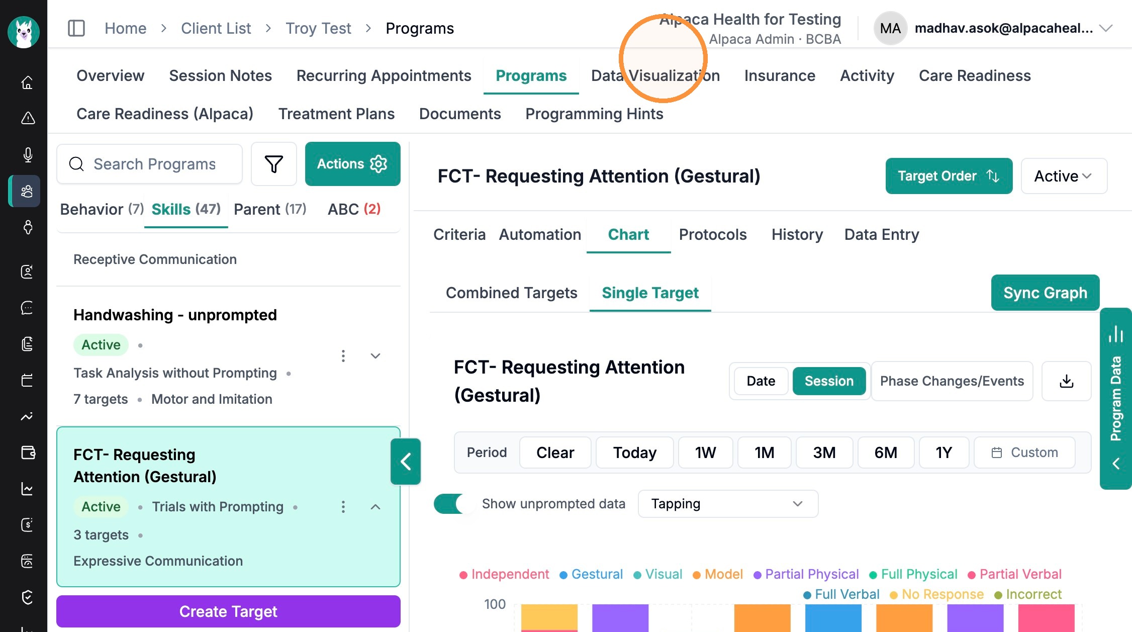
Open the client and go to the Programs tab.
Select a program from the list on the left.
Click the Chart tab.

Everything in this guide lives on this screen:
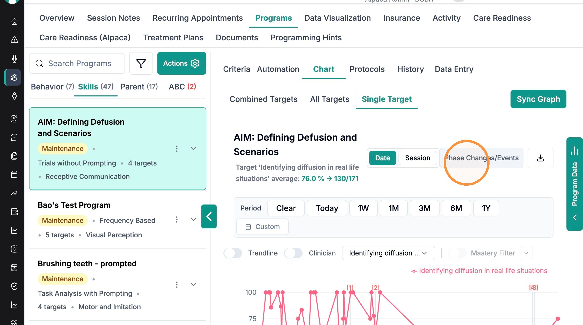
Top: the chart views (Combined Targets, All Targets, Single Target) and Sync Graph.
Under the program name: the program average.
Right side: Date / Session, Phase Changes/Events, and the download icon.
Below the graph: the Period selector and the Trendline, Clinician, and Mastery Filter toggles.
Types of charts
Use the three tabs above the graph to change what the chart shows:
Combined Targets — a single line for the whole program (the program total).
If you have set up a program with a different measurement type than at the target level, you will only be able to view targets in "single target" view.
All Targets — every target in the program on one graph, each as its own line.
Single Target — one target at a time. A target selector appears so you can choose which one.
Note: The chart also adapts to the program's measurement type — skill programs show percent correct as a line, behavior programs show frequency or rate, and prompt-based programs show prompt levels as stacked bars.
Program averages
Alpaca shows the average right under the program name, above the graph, and it updates with your date range and view:
In Combined Targets and All Targets, you see the Whole program average (for example, 77.1% → 451/585).
In Single Target, you see the selected target's average (for example, 76.0% → 130/171).
For behavior programs, the average is shown as a count or rate (for example, 106.3 times) instead of a percentage.
Graph settings
The controls above and beside the graph let you shape the view:
Date vs Session — plot the x-axis by calendar date or by session number.
Period — quick ranges (1W, 1M, 3M, 6M, 1Y), plus Custom, Today, and Clear.
Trendline — overlay a trend line on the data.
Clinician — break the data out by the clinician who collected it.
Mastery Filter — filter the graph by mastery status (may be unavailable in some views).
Show unprompted data — on prompt-based programs, switch between prompted and unprompted data, with a selector for the target or behavior.
Download icon — export the current graph as an image.
Sync Graph / Program Data — refresh the chart with your latest selections, and open the underlying data from the Program Data tab on the right edge.
Phase changes and event lines
Phase changes and events appear as vertical lines on the graph, so you can see what was happening when the data changed:
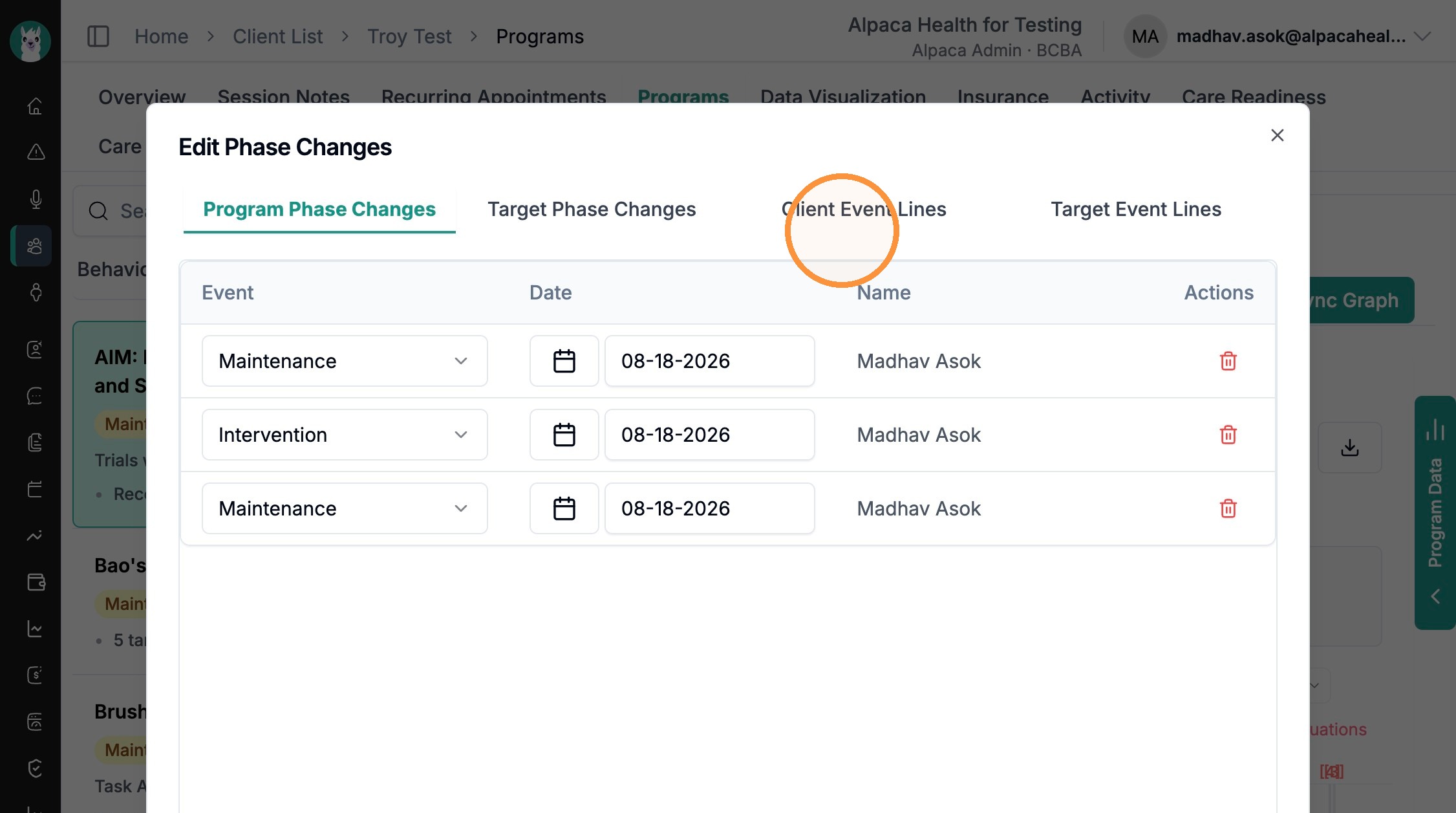
Phase changes mark a program or target moving between phases (for example, Intervention to Maintenance).
Event lines mark custom events you log (for example, "School Started"), at the client or target level.
To show, hide, or edit them:
On the chart, click Phase Changes/Events.
In the editor, use the four tabs to manage each type: Program Phase Changes, Target Phase Changes, Client Event Lines, and Target Event Lines.
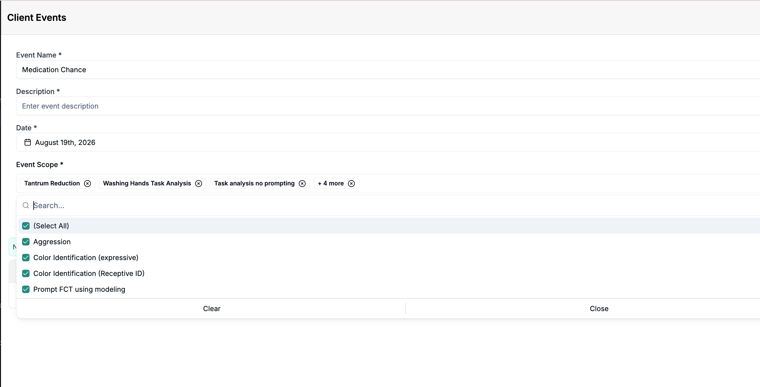
To add an event, open Client Event Lines (or Target Event Lines) and click Add New Event. Enter an Event Name, Description, and Date, then set the Event Scope (the programs the event applies to) and click Submit.
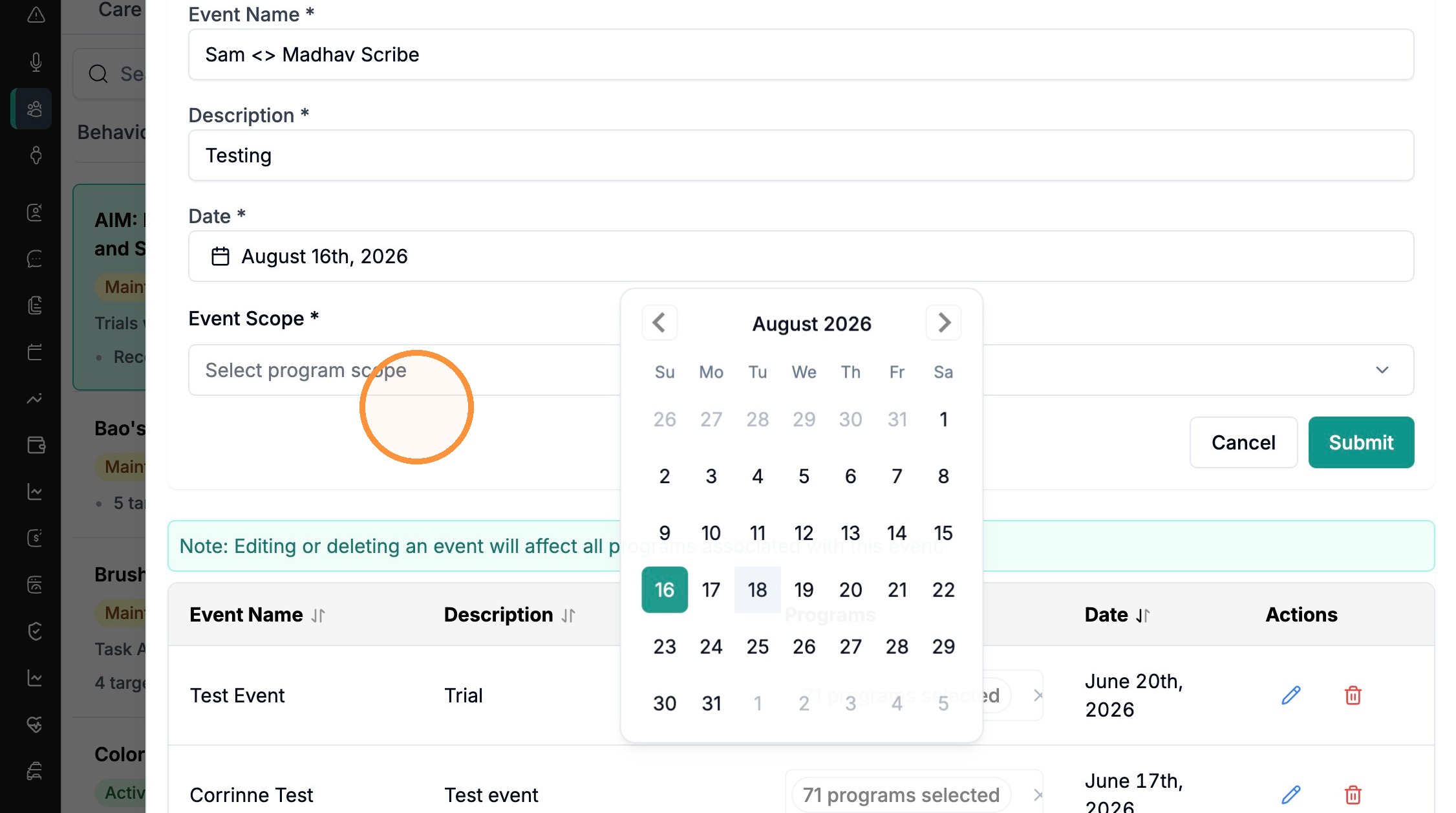
Note: Editing or deleting an event affects every program associated with that event.
Bulk Phase Change/ Event Lines
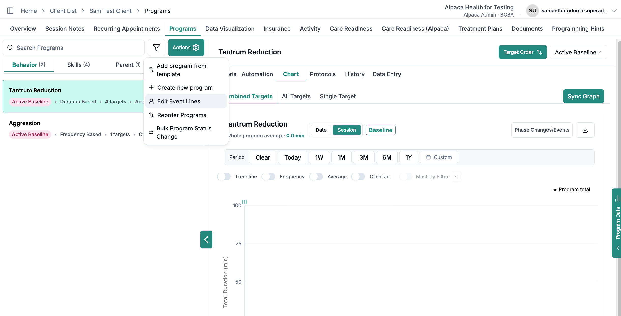
Phase changes can be added across some or all programs and behaviors by accessing "actions", then "edit event lines".
Data Visualization: overlapping graphs
The Data Visualization tab lets you view several programs together and overlap their graphs.
From the client, click the Data Visualization tab.
Click + Add program and choose the programs you want to compare. Each one appears as a chip you can remove with the x.
Switch between Grid and Overlay. Grid shows each program side by side; Overlay puts all the programs on one overlapping graph.
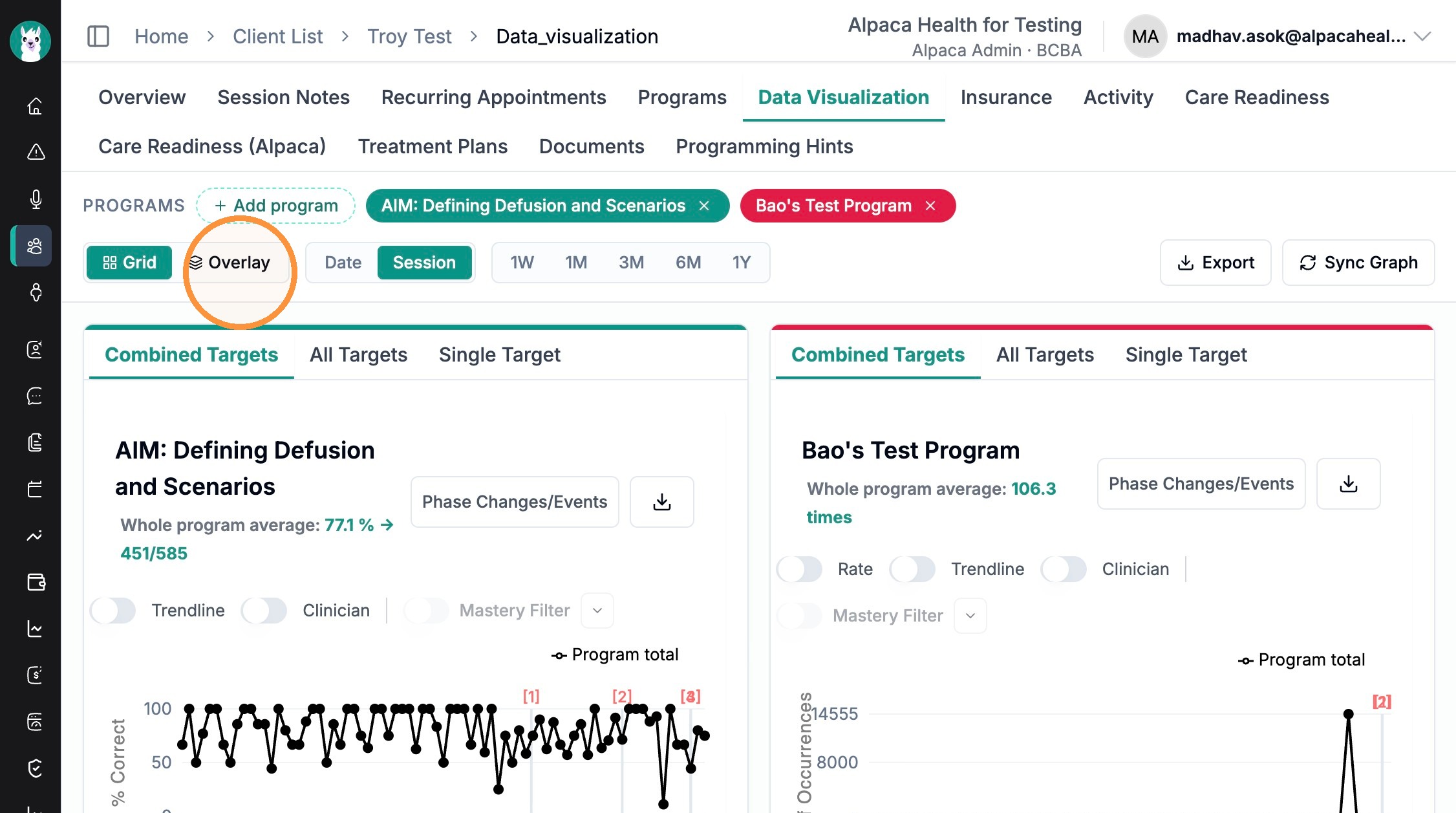
The same controls work here too — Date/Session, the time period, and Phase Changes/Events all behave the same way, plus Export to download and Sync Graph to refresh.